Gallery of Customer Work
Here we display some of our favorite pieces of poster graphic design. We hope they will inspire you to create a great-looking poster. (All posters are copyright by their creators and are used by their express permission. So don't worry -- we would never put your poster here without asking you via email.)
For a lot more examples you may want to check out ePosters.net. Keep in mind these haven't been selected for great graphic design, but they do give a good idea of what "typical" posters look like.
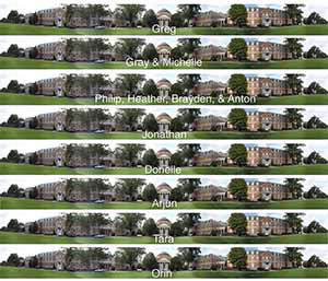
A beautiful panoramic photo, and a nice welcome back for some UNC students -- we do more than just research posters :) (enlarge)
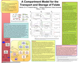
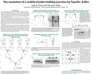
Looks a bit like an Easter-egg hunt, but the no-two-alike boxes really convey "compartments". Carefully here -- it would be easy to cross over to "ugly". (enlarge)
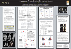
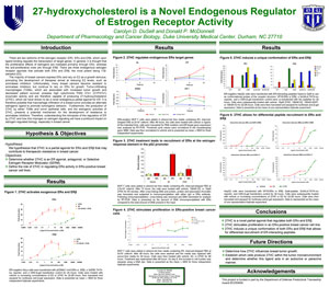
Gorgeous, elegant shades of gray (slightly cool) with rich but muted primaries in the graphs. Not easy to pull off, but one of my favorites. (enlarge)
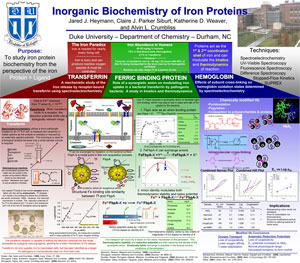
Tri-color organizational scheme is intense at the top for emphasis, soft at the bottom to not overwhelm the substance. (enlarge)

A very clean design that lets its (somewhat gruesome) images tell the story, with text in a supporting role. (enlarge)

One of the few blue posters I've seen that looks decent, because the blue is a bit desaturated: RGB 53,53,153 (#333399). (enlarge)
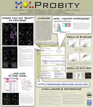
Mine again! Deliberately informal, the headers (but not body!) are in a funky comic font. Drop shadows lend it depth. Created in Adobe Illustrator. (enlarge)
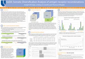
One of the best I've ever seen -- perfect balance of color and line. Even the figures match the color scheme! Joe claims he was inspired by some of the other posters on this page, but in my opinion, he surpassed them all. (enlarge)
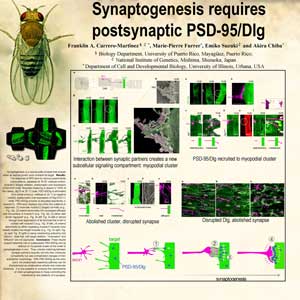
Although I wish the black box wasn't there, this poster is one of the few to make really good use of a background image. (enlarge)
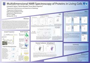
Although the text is a bit close to the edges, the angled boxes and tasteful gradients definitely attract attention. (enlarge)
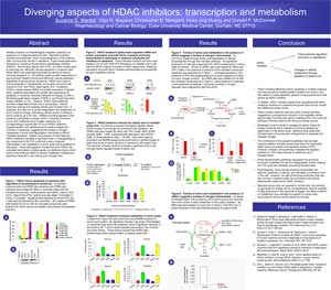
Crisp black text with restrained use of bright, primary colors makes this a visually clean and upbeat poster. (enlarge)
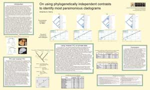
The nontraditional text-boxes-as-flowchart layout is intriguing but still easy to follow. Although the background is colored, it's not overpowering. Body text is still black on white, preserving readability. (enlarge)
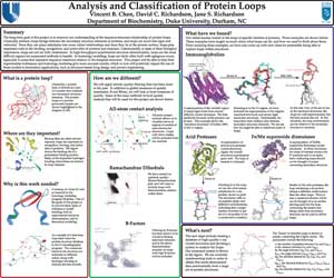
Three-column layout with a twist (great use of space). Colored boxes divide major sections; rounded corners soften it a bit. (enlarge)
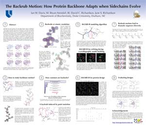
My poster (couldn't resist). Uses negative space and numbering to separate chunks of content. Created in Adobe Illustrator. (enlarge)


